android
The Checkout SDK from Ottu is a Kotlin-based library designed to streamline the integration of an Ottu-powered checkout process into Android applications. This SDK allows for complete customization of the checkout experience, including both appearance and functionality, as well as the selection of accepted payment methods.
To integrate the Checkout SDK, it must be incorporated into the Android application and initialized with the following parameters:
Additionally, various configuration options, such as accepted payment methods and theme styling for the checkout interface, can be specified to enhance the user experience.
The API private key should never be utilized on the client side; instead, use the API public key. This is essential for maintaining the security of your application and safeguarding sensitive data.
This video guides you step-by-step through the Android SDK integration process. Watch it to quickly learn how to set up, configure, and see the key features in action.
Installation
Prerequisites
The SDK is compatible with devices running Android 8 or higher (API version 26 or later).
Gradle Setup
- Add JitPack Repository
In your
settings.gradle.ktsfile, add JitPack to the repositories section underdependencyResolutionManagement:maven { url = uri("https://jitpack.io") } - Add the SDK Dependency
Include the Ottu Checkout SDK in your app-level
build.gradle.ktsfile:implementation("com.github.ottuco:ottu-android-checkout:2.1.7")
Initialization
Checkout.init
The function initiates the checkout process and configures the required settings for the Checkout SDK. It should be invoked once by the parent app to start the checkout sequence, called with set of configuration fields that encapsulate all essential options for the process.
When you call Checkout.init, the SDK manages the setup of key components for the checkout, like generating a form for customers to input their payment information, and facilitating the communication with Ottu's servers to process the payment.
This function returns a Fragment object, which is a native Android UI component that can be integrated into any part of an Activity instance (also native to Android).
Integration Guide
- Add FrameLayout to the Layout File
Inside
activity_main.xml(located in theres/layoutfolder), add aFrameLayoutwith the IDottuPaymentView:android:id="@+id/ottuPaymentView" - Import Required Modules
Usually, Android Studio automatically imports the necessary modules. However, for reference, the Ottu SDK requires the following imports:
import com.ottu.checkout.Checkout
import com.ottu.checkout.network.model.payment.ApiTransactionDetails
import com.ottu.checkout.ui.base.CheckoutSdkFragment - Extend the Activity Class
Ensure that the Activity integrating with the Checkout SDK inherits from
AppCompatActivity:class MainActivity : AppCompatActivity() { - Declare Checkout Fragment VariableAdd a member variable for the
CheckoutSdkFragmentobject:private var checkoutFragment: CheckoutSdkFragment? = null - Initialize Checkout SDKInside the
onCreatefunction, add the SDK initialization code:// populate the fields below with correct values
val merchantId = "" // your merchant base URL
val sessionId = "" // the transaction ID
val apiKey = "" // merchant public API Key
val amount = 10.0 // decimal number
// List mode just to look better
val paymentOptionsDisplaySettings = Checkout.PaymentOptionsDisplaySettings(
Checkout.PaymentOptionsDisplayMode.List(5))
// Builder class is used to construct an object passed to the SDK initializing function
val builder = Checkout
.Builder(merchantId!!, sessionId, apiKey!!, amount!!)
.paymentOptionsDisplaySettings(paymentOptionsDisplaySettings)
.logger(Checkout.Logger.INFO)
.build()
if (Checkout.isInitialized) {
Checkout.release()
}
lifecycleScope.launch {
runCatching {
Checkout.init(
context = this@MainActivity,
builder = builder,
successCallback = {
Log.e("TAG", "successCallback: $it")
//showResultDialog(it)
},
cancelCallback = {
Log.e("TAG", "cancelCallback: $it")
//showResultDialog(it)
},
errorCallback = { errorData, throwable ->
Log.e("TAG", "errorCallback: $errorData")
//showResultDialog(errorData, throwable)
},
)
}.onSuccess {
checkoutFragment = it
supportFragmentManager
.beginTransaction()
.replace(R.id.ottuPaymentView, it)
.commit()
}.onFailure {
//showErrorDialog(it)
}
} - (Optional) Implement Result and Error Dialogs
Uncomment
showResultDialogandshowErrorDialogin the code above and add their implementations as methods inside the sameMainActivity:private fun showResultDialog(result: JSONObject?, throwable: Throwable? = null) {
val sb = StringBuilder()
result?.let {
sb.apply {
append(("Status : " + result.opt("status")) + "\n")
append(("Message : " + result.opt("message")) + "\n")
append(("Session id : " + result.opt("session_id")) + "\n")
append(("operation : " + result.opt("operation")) + "\n")
append(("Reference number : " + result.opt("reference_number")) + "\n")
append(("Challenge Occurred : " + result.opt("challenge_occurred")) + "\n")
append(("Form of payment: " + result.opt("form_of_payment")) + "\n")
}
} ?: run {
sb.append(throwable?.message ?: "Unknown Error")
}
AlertDialog.Builder(this)
.setTitle("Order Information")
.setMessage(sb)
.setPositiveButton(
android.R.string.ok
) { dialog, which ->
dialog.dismiss()
}
.show()
}
private fun showErrorDialog(throwable: Throwable? = null) {
if (throwable is SecurityException) return
AlertDialog.Builder(this)
.setTitle("Failed")
.setMessage(throwable?.message ?: "Unknown Error")
.setPositiveButton(
android.R.string.ok
) { dialog, which ->
finish()
dialog.dismiss()
}
.show()
} - Clean Up MemoryTo ensure proper resource management, override the
onDestroymethod:override fun onDestroy() {
super.onDestroy()
if (isFinishing) {
Checkout.release()
}
} - Verify Imports
Finally, confirm that all required imports are present. Android Studio usually detects and adds them automatically.
Notes on Initialization Parameters
Not all parameters in Checkout.init are mandatory.
The required parameters are:
sessionId– ID of the created transactionmerchantId– Same as the domain used in HTTP requestsapiKey– Public API key used for authorization
Recommended optional parameters:
formsOfPaymentsetupPreload(to reduce initialization time)
setupPreload is an object taken from the transaction creation response. When passed to the SDK, it prevents it from requesting the transaction details on its own and therefore speed-ups the initialization process by several seconds. This setupPreload is a decoded JSON object to a TransactionDetails
For reference, check the example: here
Properties
Required Properties
merchantId string required
The merchant_id identifies your Ottu merchant domain. It should be the root domain of your Ottu account, excluding the "https://" or "http://" prefix.
For instance, if your Ottu URL is https://example.ottu.com, then your merchant_id would be example.ottu.com. This attribute is utilized to determine which Ottu merchant account to associate with the checkout process.
apiKey string required
The apiKey is your Ottu API public key, which is essential for authenticating communications with Ottu's servers during the checkout process.
Make sure to use the public key and avoid using the private key. The API private key must be kept confidential at all times and should never be shared with any clients.
sessionId string required
The session_id serves as the unique identifier for the payment transaction linked to the checkout process.
This identifier is automatically generated at the creation of the payment transaction. For additional details on how to utilize the session_id parameter in the Checkout API, refer to the session_id section.
successCallback, errorCallback and cancelCallback Unit required
Callback functions are used to retrieve the payment status and must be provided directly to the Checkout initialization function. For more details, refer to the Callbacks section.
Display Options
formsOfPayment array optional
The formsOfPayment parameter allows customization of the payment methods displayed in the checkout process. By default, all forms of payment are enabled.
Available Options for formsOfPayment
cardOnsite: A direct payment method (onsite checkout) where cardholder data (CHD) is entered directly in the SDK. If 3DS authentication is required, a payment provider is involved.tokenPay: Uses tokenization to securely store and process customers' payment information.redirect: Redirects customers to an external payment gateway or a third-party payment processor to complete the transaction.stcPay: Requires customers to enter their mobile number and authenticate with an OTP sent to their device to complete the payment.flexMethods: Allows payments to be split into multiple installments. These methods, also known as BNPL (Buy Now, Pay Later), support providers such as Tabby and Tamara.
displaySettings object optional
The PaymentOptionsDisplaySettings struct is used to configure how payment options are displayed.
The display of payment options can be adjusted using the SDK with the following settings:
mode(BottomSheetor List)visibleItemsCount(default is 5)defaultSelectedPgCode(default is none)
By default, BottomSheet mode is used, as was implemented in previous releases. List mode is a new option that allows the list of payment methods to be displayed above the Payment Details section and the Pay button.
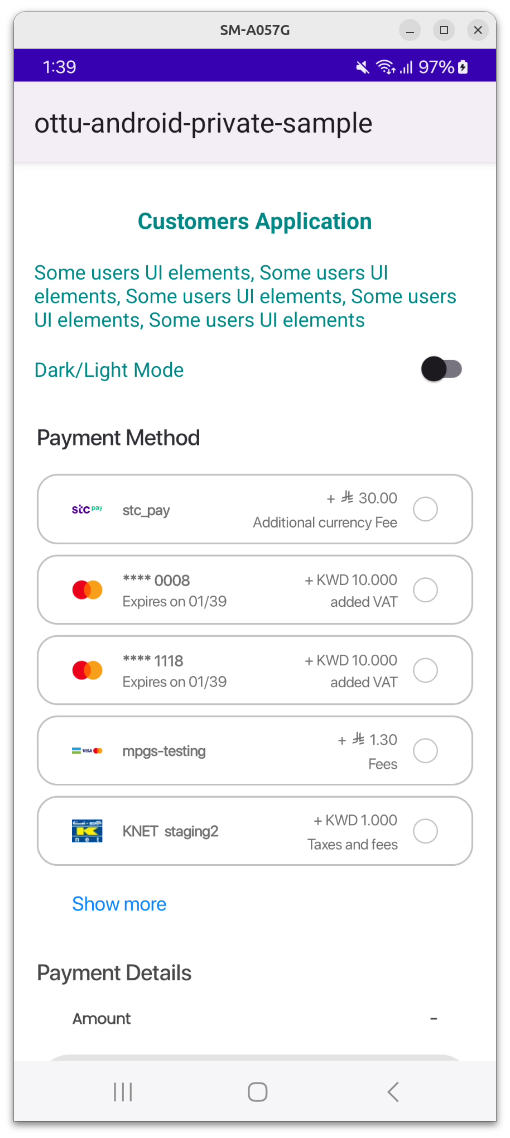
A view with a selected item:
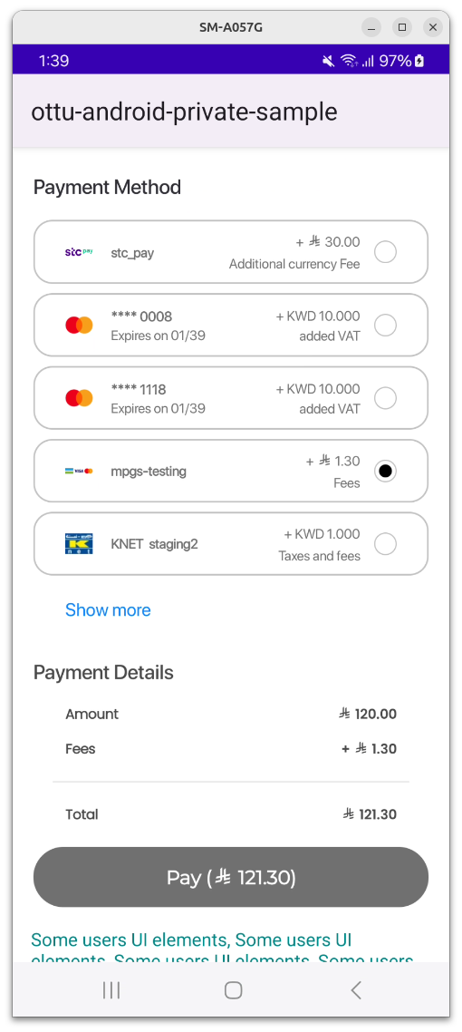
A view with an expanded list:
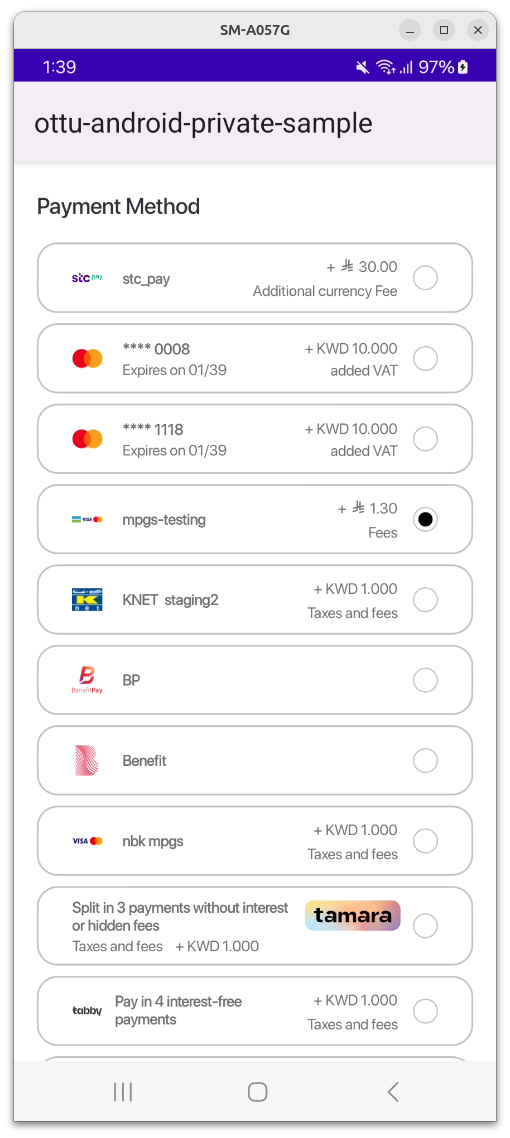
visibleItemsCountis an unsigned integer that sets the number of items to be displayed at once. It works only in List mode. If the number of available payment options is fewer than this value, the list height is automatically adjusted to the minimum required.
If 0 is passed, an exception is thrown by the SDK, which must be handled by the parent app.
defaultSelectedPgCodeis a PG code that will be automatically selected. The SDK searches for the payment option with the matching PG code and selects it if found. If no match is found, no selection is made.
All these parameters are optional and are constructed using the following function:
private fun getPaymentOptionSettings(): Checkout.PaymentOptionsDisplaySettings {
    val visibleItemsCount = 5 // set needed value here
    val selectedPgCode = "knet" // set needed value here
    val mode = Checkout.PaymentOptionsDisplaySettings.PaymentOptionsDisplayMode.List(visibleItemsCount)
    return Checkout.PaymentOptionsDisplaySettings(mode, selectedPgCode)
}
These parameters are passed to the Checkout.init builder class via the following object:
.displaySettings(displaySettings)
To view the full function call, please refer to the Full Example chapter in the documentation.
Preloading
setupPreload object optional
The TransactionDetails class object stores transaction details.
If this object is provided, the SDK will not need to retrieve transaction details from the backend, thereby reducing processing time and improving efficiency.
Theme
theme object optional
The Theme class object is used for UI customization, allowing modifications to background colors, text colors, and fonts for various components.
All fields in the Theme class are optional. If a theme is not specified, the default UI settings will be applied.
The class responsible for defining the theme is called CheckoutTheme.
Customization Theme Class Structure:
class CheckoutTheme(
    val uiMode: UiMode = UiMode.AUTO,
    val appearanceLight: Appearance ? = null,
    val appearanceDark : Appearance ? = null,
    val showPaymentDetails : Boolean = true,
)
uiMode
Specifies the device theme mode, which can be set to:
- Light
- Dark
- Auto (automatically adjusts based on system settings)
appearanceLight & appearanceDark
These are optional instances of the Appearance class, which enable UI customization for light mode and dark mode, respectively.
The Appearance class serves as the core inner class of CheckoutTheme, containing objects that define various UI components.
The component names within Appearance largely correspond to those described here.
showPaymentDetails
A boolean field that determines whether the "Payment Details" section should be displayed or hidden.
Properties Description
All properties are optional and can be customized by the user.
If a property is not specified, the default value (as defined in the Figma design here) will be automatically applied.
Texts
General
| Property Name | Description | Data Type |
|---|---|---|
mainTitleText | Font and color for all "Captions" | Text |
titleText | Font and color for payment options in the list | Text |
subtitleText | Font and color for payment options details (like expiration date) | Text |
Fees
| Property Name | Description | Data Type |
|---|---|---|
feesTitleText | Font and color of fees value in the payment options list | Text |
feesSubtitleText | Font and color of fees description in the payment options list | Text |
Data
| Property Name | Description | Data Type |
|---|---|---|
dataLabelText | Font and color of payment details fields (like "Amount") | Text |
dataValueText | Font and color of payment details values | Text |
Other
| Property Name | Description | Data Type |
|---|---|---|
errorMessageText | Font and color of error message text in pop-ups | Text |
selectPaymentMethodHeaderText | The text of "Select Payment Method" in the bottom sheet header | Text |
Text Fields
| Property Name | Description | Data Type |
|---|---|---|
inputTextField | Font and color of text in any input field (including disabled state) | TextField |
Colors
| Property Name | Description | Data Type |
|---|---|---|
sdkbackgroundColor | The main background of the SDK view component | Color |
modalBackgroundColor | The background of any modal window | Color |
paymentItemBackgroundColor | The background of an item in payment options list | Color |
selectorIconColor | The color of the icon of the payment | Color |
savePhoneNumberIconColor | The color of "Diskette" button for saving phone number | Color |
selectPaymentMethodHeaderBackgroundColor | The background of an item in payment options list | Color |
Buttons
| Property Name | Description | Data Type |
|---|---|---|
button | Background, text color and font for any button | Button |
backButton | Color of the "Back" navigation button | RippleColor |
selectorButton | Background, text color and font for payment item selection button | Button |
Switch
| Property Name | Description | Data Type |
|---|---|---|
switch | Colors of the switch background and its toggle in different states (on, off and disabled) | Switch |
Margins
| Property Name | Description | Data Type |
|---|---|---|
| margins | Top, left, bottom and right margins between component | Margins |
Data Types Description
Color
| Property Name | Description | Data Type |
|---|---|---|
color | Main color integer value | Int |
colorDisabled | Disabled stated color integer value | Int |
RippleColor
| Property Name | Description | Data Type |
|---|---|---|
color | Main color integer value | Int |
rippleColor | Ripple color integer value | Int |
colorDisaled | Disabled stated color integer value | Int |
Text
| Property Name | Description | Data Type |
|---|---|---|
textColor | Main color integer value | Color |
fontType | Font resource ID | Int |
TextField
| Property Name | Description | Data Type |
|---|---|---|
background | Background color integer value | Color |
primaryColor | Text color | Color |
focusedColor | Selected text color | Color |
text | Text value | Text |
error | Text value | Text |
Button
| Property Name | Description | Data Type |
|---|---|---|
rippleColor | Button background color | RippleColor |
fontType | Button text font ID | Int |
textColor | Button text color | Color |
Switch
| Property Name | Description | Data Type |
|---|---|---|
checkedThumbTintColor | Toggle color in checked state | Int |
uncheckedThumbTintColor | Toggle color in unchecked state | Int |
checkedTrackTintColor | Track color in checked state | Int |
uncheckedTrackTintColor | Track color in unchecked state | Int |
checkedTrackDecorationColor | Decoration color in checked state | Int |
uncheckedTrackDecorationColor | Decoration color in unchecked state | Int |
Margins
| Property Name | Data Type |
|---|---|
left | Int |
top | Int |
right | Int |
bottom | Int |
Theme Example
To build the theme, the user must follow steps similar to those outlined in the test app file.
Code Snippet:
val appearanceLight = CheckoutTheme.Appearance(
    mainTitleText = CheckoutTheme.Text(
        textColor = CheckoutTheme.Color(Color.WHITE),
        R.font.roboto_bold
    ),
    titleText = CheckoutTheme.Text(textColor = CheckoutTheme.Color(Color.BLACK)),
    subtitleText = CheckoutTheme.Text(textColor = CheckoutTheme.Color(Color.BLACK)),

    button = CheckoutTheme.Button(
        rippleColor = CheckoutTheme.RippleColor(
            color = Color.WHITE,
            rippleColor = Color.BLACK,
            colorDisabled = Color.GRAY
        ),
        textColor = CheckoutTheme.Color(color = Color.BLACK),
        fontType = R.font.roboto_bold
    ),

    margins = Margins(left = 12, top = 4, right = 12, bottom = 4),

    sdkBackgroundColor = CheckoutTheme.Color(color = Color.WHITE)
)

return CheckoutTheme(
    uiMode = CheckoutTheme.UiMode.AUTO,
    showPaymentDetails = showPaymentDetails,
    appearanceLight = appearanceLight,
    appearanceDark = appearanceDark,
)
SDK Configuration
Language
The SDK supports two languages, English and Arabic, with English set as the default.
It automatically adopts the language configured in the device settings, requiring no in-app adjustments. However, if a transaction is initiated in a different language and setup preload is utilized, the backend-generated text (such as fee descriptions) will appear in the language of the transaction. Therefore, it is important to ensure that the language code passed to the Checkout API's transaction creation request matches the currently selected language on the device or current selected app language.
Light and dark theme
The SDK supports UI customization to match the device theme—light or dark. This adjustment is applied during the SDK initialization, based on the device's settings. Similarly, for language, no adjustments are made within the app.
Native UI
The SDK UI is embedded as a Fragment within any part of an Activity in the merchant's application.
Example:
If a wallet is the only available payment option, the UI is minimized automatically.
To avoid style issues and potential crashes, the parent application's theme must be Theme.AppCompat or one of its descendant classes. This theme is specified in the themes.xml file located in the values directory of the project.
Wallet Configuration
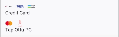
STC Pay
Once the STC Pay integration between Ottu and STC Pay has been completed, the necessary checks are automatically handled by the Checkout SDK to ensure the seamless display of the STC Pay button.
Upon initialization of the Checkout SDK with the session_id and payment gateway codes (pg_codes), the following condition is automatically verified:
- The
session_idand pg_codes provided during SDK initialization must be linked to the STC Pay Payment Service. This verification ensures that the STC Pay option is made available for selection as a payment method.
Regardless of whether a mobile number has been entered by the customer during transaction creation, the STC Pay button is displayed by the Android SDK.
Onsite Checkout
This payment option facilitates direct payments within the mobile SDK. A user-friendly interface allows users to securely input their CHD. If permitted by the backend, the card can be stored as a tokenized payment for future transactions.
Example:
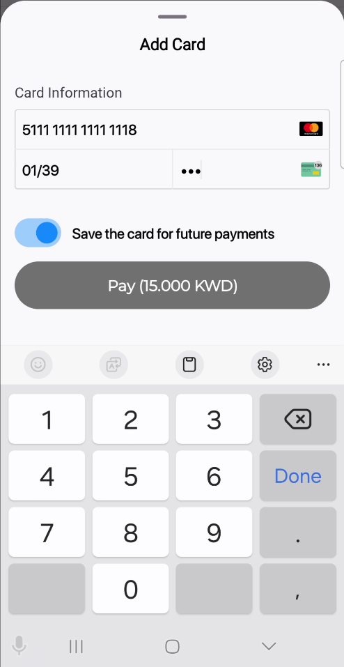
The SDK supports multiple instances of onsite checkout payments. Therefore, for each payment method with a PG code of ottu_pg, the card form (as shown above) will be displayed.
Fees are not displayed for onsite checkout instances due to the support of multiple card types through omni PG (multi-card) configurations. The presence of multiple payment icons also indicates this multi-card functionality.
Callbacks
In the Checkout SDK, callback functions are essential for delivering real-time updates on the status of payment transactions. These callbacks improve the user experience by facilitating smooth and effective management of different payment scenarios, including errors, successful transactions, and cancellations.
The callbacks outlined below are applicable to any type of payment.
errorCallback
The errorCallback is a callback function triggered when issues occur during a payment process. Properly handling these errors is essential for maintaining a smooth user experience.
The best practice recommended in the event of an error is to restart the checkout process by generating a new session_id through the Checkout API.
To set up the errorCallback function, use the data-error attribute on the Checkout script tag to designate a global function that will manage errors. If an error arises during a payment, the errorCallback function will be called, receiving a JSONObject with a data.status value indicating an error.
Params Available in data JSONObject for errorCallback
messagemandatoryform_of_paymentmandatorystatusmandatorychallenge_occurredoptionalsession_idoptionalorder_nooptionalreference_numberoptional
cancelCallback
The cancelCallback is a callback function in the Checkout SDK that is activated when a payment is canceled.
To configure the cancelCallback function, you can use the data-cancel attribute on the Checkout script tag to specify a global function that will handle cancellations. If a payment is canceled by a customer, the cancelCallback function will be called, and it will receive a JSONObject containing a data.status value of "canceled".
Params Available in data JSONObject for cancelCallback
messagemandatoryform_of_paymentmandatorychallenge_occurredoptionalsession_idoptionalstatusmandatoryorder_nooptionalreference_numberoptionalpayment_gateway_infooptional
In both cancelCallback and errorCallback, the SDK must be reinitialized, either on the same session or on a new session.
successCallback
The successCallback is a function that is triggered when the payment process is successfully completed. This callback receives a JSONObject containing a data.status value of "success."
Params Available in data JSONObject for successCallback
messagemandatoryform_of_paymentmandatorychallenge_occurredoptionalsession_idoptionalstatusmandatoryorder_nooptionalreference_numberoptionalredirect_urloptionalpayment_gateway_infooptional
The successCallback function is defined and assigned by setting the data-success attribute on the Checkout script tag. This attribute specifies a global function that will be invoked when the payment process successfully completes.
Examples
Basic Example
The SDK triggers three main callbacks:
successCallback– Invoked upon successful payment.cancelCallback– Triggered when the user cancels the transaction.errorCallback– Activated on errors during the checkout process.
Developers should customize the logic within these callbacks to handle transaction results appropriately.
Full Example
val theme = getCheckoutTheme()

// Builder class is used to construct an object passed to the SDK initializing function
val builder = Checkout
  .Builder(merchantId!!, sessionId, apiKey!!, amount!!)
  .displaySettings(displaySettings)
  .formsOfPayments(formsOfPayment)
  .theme(theme)
  .logger(Checkout.Logger.INFO)
  .build()


// Actual `init` function calling, returning a `Fragment` object
checkoutFragment = Checkout.init(
  context = this @CheckoutSampleActivity,
  builder = builder,
  transactionResultCallback = object: Checkout.TransactionResultCallback {
    override fun onTransactionResult(result: TransactionResult) {
      showResultDialog(result)
    }
  }
)
Error Reporting & Security
Error Reporting
The SDK utilizes Sentry for error logging and reporting, with initialization based on the configuration provided by SDK Studio.
Since the SDK is embedded within the merchant's application, conflicts may arise if Sentry is also integrated into the app. To prevent such conflicts, Sentry can be disabled within the Checkout SDK by setting the is_enabled flag to false in the configuration.
Rooting Detection
The SDK prevents execution on rooted devices.
To enforce this restriction, rooting checks are performed during SDK initialization. If a device is detected as rooted, a modal alert dialog is displayed, providing an explanation. The message shown is as follows:
This device is not secure for payments. Transactions are blocked for security reasons.
After dismissing the alert, the app crashes unexpectedly
Checkout.init function needs to be called in a coroutine.
Screen Capture Prevention
The SDK is designed to protect sensitive data by restricting screen capture functionalities. These restrictions apply to the entire Activity that contains the SDK and operate as follows:
- Screenshot Attempts:
If a user attempts to take a screenshot, a toast message will appear stating:
&#xNAN;"This app doesn't allow screenshots." - Screen Recording After SDK Initialization:
If screen recording is initiated after the SDK has been initialized, the following toast message is displayed:
&#xNAN;"Can't record screen due to security policy." - Screen Recording Before SDK Initialization:
If screen recording begins before the SDK is initialized, the entire Activity containing the SDK will appear as a black screen in the recorded video.