flutter
The Checkout SDK is a Flutter framework (library) developed by Ottu, designed to seamlessly integrate an Ottu-powered checkout process into Flutter applications for both iOS and Android platforms. This framework functions as a wrapper over the corresponding native SDKs, ensuring a smooth and efficient payment experience.
With the Checkout SDK, both the visual appearance and the forms of payment available during the checkout process can be fully customized to meet specific requirements.
To integrate the Checkout SDK, the library must be added to the Flutter application and initialized with the following parameters:
Additionally, optional configurations such as the forms of payment to be accepted and the theme styling for the checkout interface can be specified.
This video walks you through the complete Flutter SDK integration process. Follow along to easily set up, configure, and explore the core features in action.
In this video, we'll walk you through the complete process of preparing and releasing your Android application. You'll learn how to verify your build.gradle.kts configuration, set up and update ProGuard rules, and resolve missing rule issues to ensure a smooth release build. Follow along step by step as we guide you through the commands and configuration updates needed to successfully generate your release APK. For further information, please refer to the Releasing Your App section.
Installation
Prerequisites
Android
The SDK can be used on devices running Android 8 (Android SDK 26) or higher.
To prevent application crashes, it must be ensured that the correct parent theme is applied to the Android application. The theme configuration is defined in the themes.xml and/or styles.xml files located within the res/values directory. The parent attribute of the style tag should be set to Theme.Material3.DayNight.NoActionBar.
For reference, the configuration file can be reviewed at the following link: themes.xml on GitHub
iOS
The SDK can be used on devices running iOS 15 or higher.
Flutter Setup
- Create a New Flutter Project
Here are tutorials on how to create a new Flutter project from scratch for different IDEs: Create a new Flutter app
You can use any IDE of your choice; however, it is recommended to use Android Studio and select "New Flutter Project", ensuring the selected programming language is Kotlin.
Once the project is created, you can proceed to add the Ottu Checkout SDK.
- Add the Ottu Checkout SDK Dependency
Open the
pubspec.yamlfile, navigate to the dependencies section, and add the following block:ottu_flutter_checkout:
git:
url: https://github.com/ottuco/ottu-flutter.git
ref: 2.1.15 - Install DependenciesRun the following command to download the dependencies:
flutter pub getinfoIf you choose to use CocoaPods, please use release version 2.1.15-cocoapods.
Initialization
SDK Initialization
The Checkout SDK is initialized using the CheckoutArguments class, which includes the properties listed below.
To initialize the SDK, an instance of CheckoutArguments must be passed as an argument to the OttuCheckoutWidget object.
For a detailed implementation example, refer to the Examples section.
Integration Guide
Open the screen or widget where you plan to add the Ottu SDK widget.
- Define
ValueNotifierIn the State class of your screen widget, define a new member of type
ValueNotifier<int>:final _checkoutHeight = ValueNotifier(300);Here, the default value of 300 represents the most suitable height for the
OttuCheckoutWidget. - Add and Wrap
OttuCheckoutWidgetAdd theOttuCheckoutWidgetto the desired location in your layout.Wrap the
OttuCheckoutWidgetinside aSizedBox, then wrap thisSizedBoxwithin aValueListenableBuilder<int>to dynamically adjust the widget height based on theValueNotifiervalue.Set the
valueListenableparameter of the builder to the value you created earlier in previous step.ValueListenableBuilder(
valueListenable: _checkoutHeight,
builder: (context, height, child) {
return SizedBox(
height: height.toDouble(),
child: OttuCheckoutWidget(
arguments: CheckoutArguments(
merchantId: "alpha.ottu.net",
apiKey: 'your Api key',
sessionId: 'your session id',
amount: 20.0,
showPaymentDetails: true,
paymentOptionsDisplaySettings: PaymentOptionsDisplaySettings(
mode: PaymentOptionsDisplayMode.BOTTOM_SHEET,
visibleItemsCount: 5,
defaultSelectedPgCode: "",
),
),
),
);
},
), - Define
MethodChanneland ConstantDefine your
MethodChannelas a top-level member of the file. It listens to messages from the native Android or iOS view:const _methodChannel = MethodChannel("com.ottu.sample/checkout");Also, define a constant string member to identify the channel's method name:
const _methodCheckoutHeight = "METHOD_CHECKOUT_HEIGHT"; - Register
MethodChannelHandlerRegister a handler for this
MethodChannel. It is recommended to do this inside thedidChangeDependencies()widget state callback method:@override
void didChangeDependencies() {
_methodChannel.setMethodCallHandler((call) async {
switch (call.method) {
case _methodCheckoutHeight:
int height = call.arguments as int;
_checkoutHeight.value = height;
}
});
super.didChangeDependencies();
} - Run the App
This is the final step to complete the integration. Run your Flutter app using the following command or by pressing the Run/Launch icon in your IDE:
flutter runIf all configurations and dependencies are correctly set, the app should build successfully and display the Ottu Checkout Widget.
Properties
Required Properties
merchantId string required
It is used to define the Ottu merchant domain and must be set to the root domain of the Ottu account, excluding the https:// or http:// prefix.
For example, if the Ottu URL is https://example.ottu.com, the corresponding merchant_id is example.ottu.com.
This property is required to ensure that the checkout process is correctly linked to the associated Ottu merchant account.
apiKey string required
It is the Ottu API public key, used for authentication when communicating with Ottu's servers during the checkout process.
Ensure that only the public key is used. The private key must remain confidential and must never be shared with any clients.
sessionId string required
It is a unique identifier for the payment transaction associated with the checkout process.
This identifier is automatically generated when a payment transaction is created. For further details on how to use the session_id parameter in the Checkout API, refer to the session_id documentation.
successCallback, errorCallback, and cancelCallback unit required
Callback functions are used to retrieve the payment status. These must be provided directly to the Checkout initialization function. For more information, please check here.
Display Options
formsOfPayment array optional
The formsOfPayment parameter is used to customize the forms of payment displayed in the checkout process. By default, all forms of payment are enabled.
Available options for formsOfPayment:
applePay: The Apple Pay payment method is supported, allowing purchases to be made using Apple Pay-enabled devices.cardOnsite: A direct (onsite) payment method, where customers are required to enter their card details directly within the SDK.tokenPay: A method utilizing tokenization, ensuring that customer payment information is securely stored and processed.redirect: A payment method where customers are redirected to an external payment gateway or a third-party processor to complete the transaction.stcPay: A method where customers enter their mobile number and authenticate using an OTP sent to their mobile device.
paymentOptionsDisplaySettings object optional
The PaymentOptionsDisplaySettings object accepts a PaymentOptionsDisplaySettings configuration, which defines how payment options are presented to the user during checkout.
The SDK provides flexible customization for how payment options are displayed. It supports the following optional parameters:
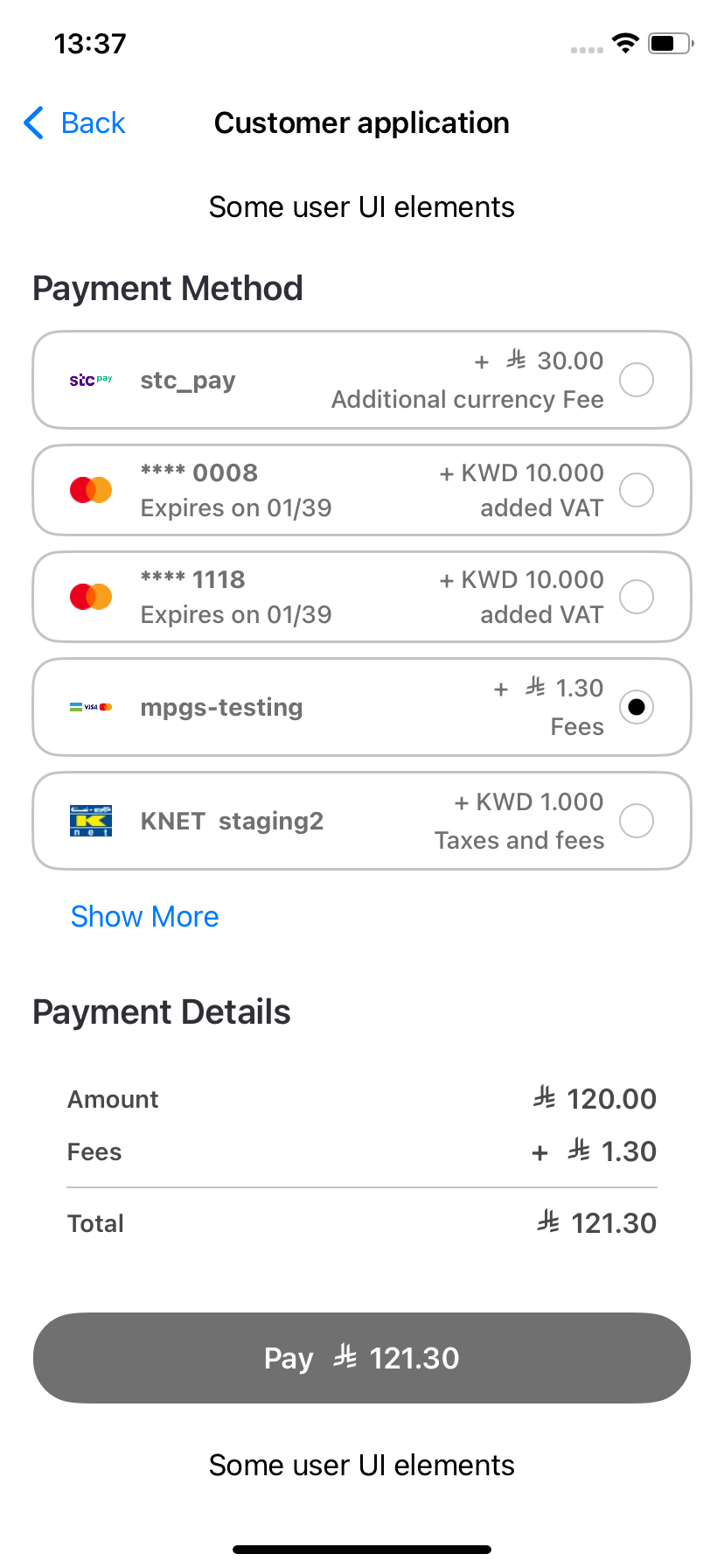
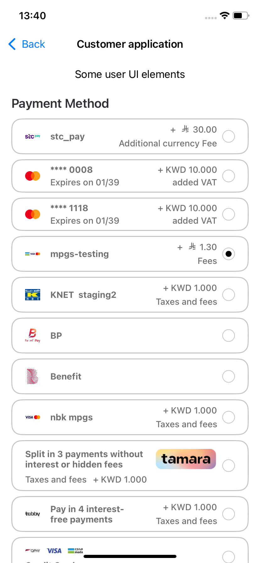
paymentOptionsListMode: Determines the layout style—eitherPaymentOptionsDisplayMode.BOTTOM_SHEET(default) orPaymentOptionsDisplayMode.LIST.- BOTTOM_SHEET: This is the default layout used in previous SDK versions.
- LIST: A new layout that shows payment options in a vertical list placed above the Payment Details section and the Pay button.
visibleItemsCount:Sets how many payment options are shown at once (default is5). Applicable only inListmode.- This unsigned integer controls how many payment options are visible simultaneously in List mode.
- If the number of available options is less than
visibleItemsCount, the list automatically resizes to fit the actual number of options.
Passing 0 will cause the SDK to throw an exception. This exception must be caught and handled by the parent application.
defaultSelectedPgCode: Specifies a payment gateway (PG) code to be pre-selected by default.- This field accepts a PG code to auto-select a specific payment option.
- If the SDK finds a payment method matching the provided PG code, it will be selected by default.
- If no match is found, no option is selected.
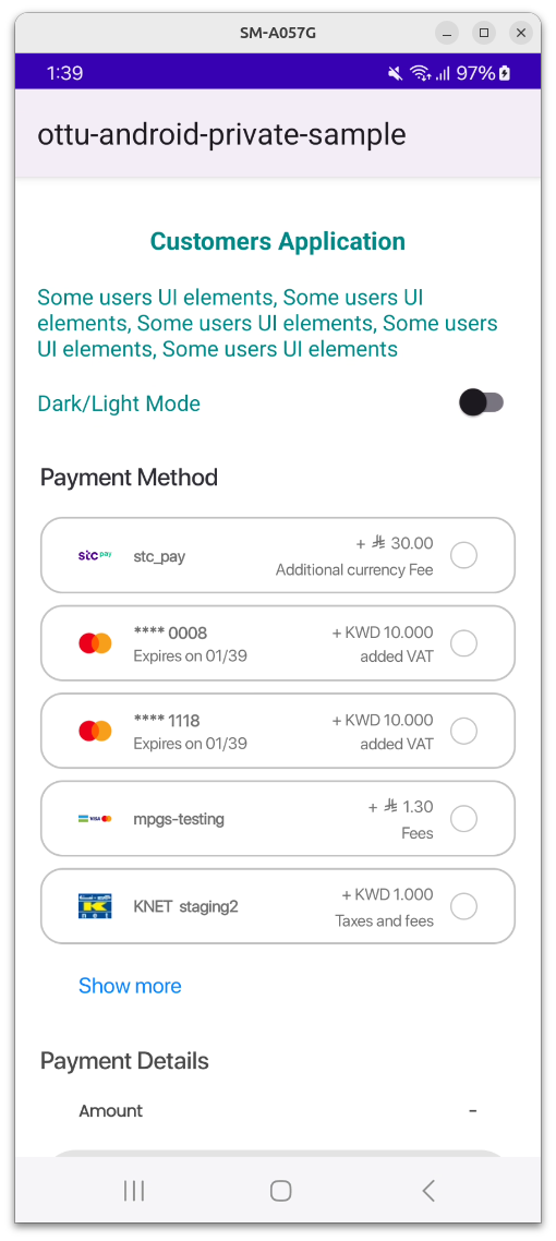
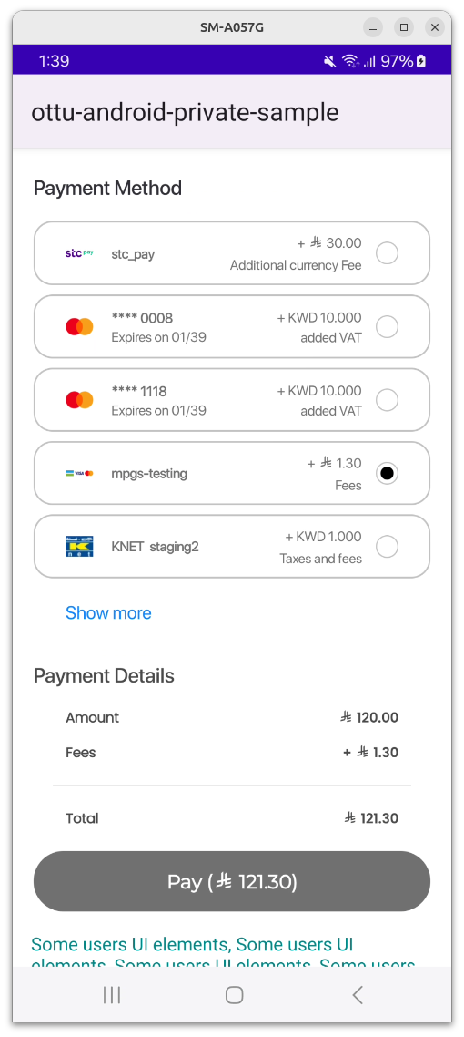
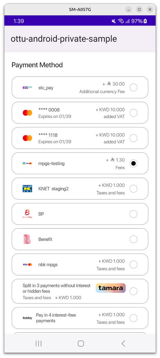
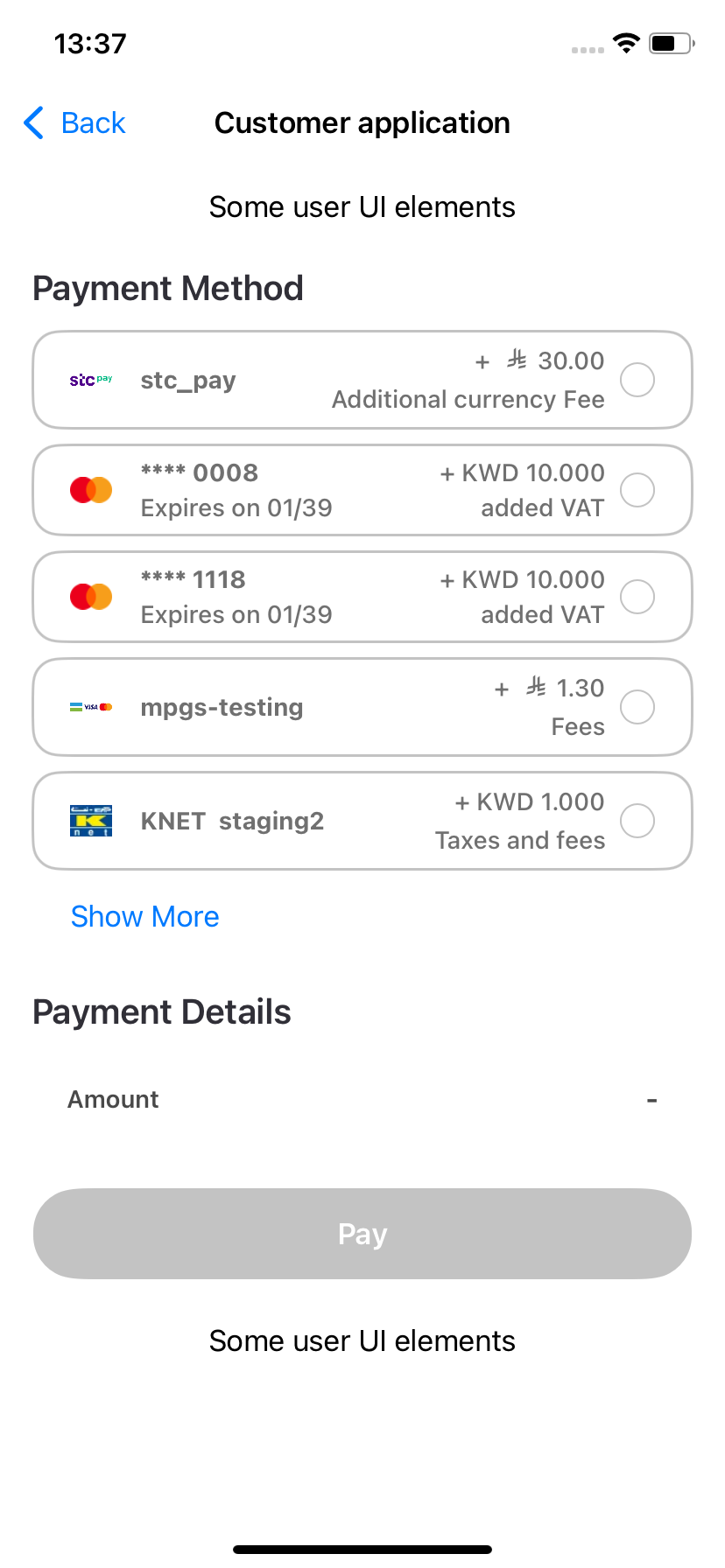
All of these parameters are optional and are demonstrated in the following figures.
Android
The List mode is displayed as illustrated in the figure below.
Here is a code sample:
val paymentOptionsDisplayMode =
if (showPaymentOptionsList) Checkout.PaymentOptionsDisplaySettings.PaymentOptionsDisplayMode.List(
visibleItemsCount = paymentOptionsListCount
)
else Checkout.PaymentOptionsDisplaySettings.PaymentOptionsDisplayMode.BottomSheet
val displaySettings = Checkout.PaymentOptionsDisplaySettings(
mode = paymentOptionsDisplayMode,
defaultSelectedPgCode = defaultSelectedPgCode
)
and passed to Checkout.init builder class via the following object:
.displaySettings(displaySettings)
iOS
The List mode looks like the following.
Here is a code sample:
let paymentOptionsDisplaySettings: PaymentOptionsDisplaySettings =
if arguments.showPaymentOptionsList {
PaymentOptionsDisplaySettings(
mode: .list,
visibleItemsCount: UInt(arguments.paymentOptionsListCount),
defaultSelectedPgCode: arguments.defaultSelectedPgCode
)
} else {
PaymentOptionsDisplaySettings(
mode: .bottomSheet,
defaultSelectedPgCode: arguments.defaultSelectedPgCode
)
}
and passed to Checkout.init via the following object:
displaySettings:paymentOptionsDisplaySettings
To see the full function call, please refer the code snippet in the Full Example section.
Preloading
setupPreload string optional
It is used to store transaction details. If provided, transaction details will not be requested from the backend, thereby reducing processing time.
Theme
theme object optional
A Theme class object is used for UI customization. All fields are optional and may include values for background colors, text colors, and fonts for various UI components.
The class responsible for defining the theme is called CheckoutTheme. It utilizes additional component classes, including:
ButtonComponentLabelComponentTextFieldComponent
The CheckoutTheme class consists of objects representing various UI components. While the component names generally align with those listed above, they also contain platform-specific fields for further customization.
Below is the structure of the Customization Theme class:
class CheckoutTheme extends Equatable {
@_UiModeJsonConverter()
final CustomerUiMode uiMode;
final TextStyle? mainTitleText;
final TextStyle? titleText;
final TextStyle? subtitleText;
final TextStyle? feesTitleText;
final TextStyle? feesSubtitleText;
final TextStyle? dataLabelText;
final TextStyle? dataValueText;
final TextStyle? errorMessageText;
final TextFieldStyle? inputTextField;
final ButtonComponent? button;
final RippleColor? backButton;
final ButtonComponent? selectorButton;
final SwitchComponent? switchControl;
final Margins? margins;
final ColorState? sdkBackgroundColor;
final ColorState? modalBackgroundColor;
final ColorState? paymentItemBackgroundColor;
final ColorState? selectorIconColor;
final ColorState? savePhoneNumberIconColor;
}
uiMode
Specifies the device Theme mode, which can be set to one of the following:
light– Forces the UI to use light mode.dark– Forces the UI to use dark mode.auto– Adapts the UI based on the device's system settings.
The uiMode parameter only affects Flutter Android and not Flutter iOS, as the flutter follows the behavior of the native implementation
Properties Description
All properties in the CheckoutTheme class are optional, allowing users to customize any of them as needed.
If a property is not set, the default value (as specified in the Figma design here) will be applied automatically.
Texts
General
| Property Name | Description | Data Type |
|---|---|---|
mainTitleText | Font and color for all "Captions" | Text |
titleText | Font and color for payment options in the list | Text |
subtitleText | Font and color for payment options details (like expiration date) | Text |
Fees
| Property Name | Description | Data Type |
|---|---|---|
feesTitleText | Font and color of fees value in the payment options list | Text |
feesSubtitleText | Font and color of fees description in the payment options list | Text |
Data
| Property Name | Description | Data Type |
|---|---|---|
dataLabelText | Font and color of payment details fields (like "Amount") | Text |
dataValueText | Font and color of payment details values | Text |
Other
| Property Name | Description | Data Type |
|---|---|---|
errorMessageText | Font and color of error message text in pop-ups | Text |
selectPaymentMethodHeaderText | The text of "Select Payment Method" in the bottom sheet header | Text |
Text Fields
| Property Name | Description | Data Type |
|---|---|---|
inputTextField | Font and color of text in any input field (including disabled state) | TextField |
Colors
| Property Name | Description | Data Type |
|---|---|---|
sdkbackgroundColor | The main background of the SDK view component | Color |
modalBackgroundColor | The background of any modal window | Color |
paymentItemBackgroundColor | The background of an item in payment options list | Color |
selectorIconColor | The color of the icon of the payment | Color |
savePhoneNumberIconColor | The color of "Diskette" button for saving phone number | Color |
selectPaymentMethodHeaderBackgroundColor | The background of an item in payment options list | Color |
Buttons
| Property Name | Description | Data Type |
|---|---|---|
button | Background, text color and font for any button | Button |
backButton | Color of the "Back" navigation button | RippleColor |
selectorButton | Background, text color and font for payment item selection button | Button |
Switch
| Property Name | Description | Data Type |
|---|---|---|
switch | Colors of the switch background and its toggle in different states (on, off and disabled) | Switch |
Margins
| Property Name | Description | Data Type |
|---|---|---|
| margins | Top, left, bottom and right margins between component | Margin |
Data Types Description
Color
| Property Name | Description | Data Type |
|---|---|---|
color | Main color integer value | Int |
colorDisabled | Disabled stated color integer value | Int |
RippleColor
| Property Name | Description | Data Type |
|---|---|---|
color | Main color integer value | Int |
rippleColor | Ripple color integer value | Int |
colorDisaled | Disabled stated color integer value | Int |
Text
| Property Name | Description | Data Type |
|---|---|---|
textColor | Main color integer value | Color |
fontType | Font resource ID | Int |
TextField
| Property Name | Description | Data Type |
|---|---|---|
background | Background color integer value | Color |
primaryColor | Text color | Color |
focusedColor | Selected text color | Color |
text | Text value | Text |
error | Text value | Text |
Button
| Property Name | Description | Data Type |
|---|---|---|
rippleColor | Button background color | RippleColor |
fontType | Button text font ID | Int |
textColor | Button text color | Color |
Switch
| Property Name | Description | Data Type |
|---|---|---|
checkedThumbTintColor | Toggle color in checked state | Int |
uncheckedThumbTintColor | Toggle color in unchecked state | Int |
checkedTrackTintColor | Track color in checked state | Int |
uncheckedTrackTintColor | Track color in unchecked state | Int |
checkedTrackDecorationColor | Decoration color in checked state | Int |
uncheckedTrackDecorationColor | Decoration color in unchecked state | Int |
Margin
| Property Name | Data Type |
|---|---|
left | Int |
top | Int |
right | Int |
bottom | Int |
Example
To build the theme, the user must follow similar steps as described in the corresponding file of the test app.
Here is a code snippet demonstrating the process:
final checkoutTheme = ch.CheckoutTheme(
uiMode: ch.CustomerUiMode.dark,
titleText: ch.TextStyle(),
modalBackgroundColor: ch.ColorState(color: Colors.amber));
SDK Configuration
Language
The SDK supports two languages: English and Arabic, with English set as the default.
The SDK automatically applies the language based on the device settings, eliminating the need for manual adjustments within the application.
However, if the transaction is created in a different language and setup preload is enabled, texts retrieved from the backend (such as fee descriptions) will be displayed in the transaction language, regardless of the device's language settings.
To ensure consistency, the current device language should be taken into account when specifying a language code in the transaction creation request of the Checkout API.
Light and Dark Theme
The SDK supports automatic UI adjustments based on the device's theme settings (light or dark mode).
The appropriate theme is applied during SDK initialization, aligning with the device's configuration. Similar to language settings, no manual adjustments are required within the application.
Native UI
Android
The SDK UI is embedded as a fragment within any part of an activity in the merchant's application.
Example:
If only one payment option is available and it is a wallet, the UI is automatically minimized.
The parent application must use a theme based on Theme.AppCompat (or a subclass) to prevent crashes and styling problems. This requirement is defined in the themes.xml file within the values directory of the project.
Wallet Configuration
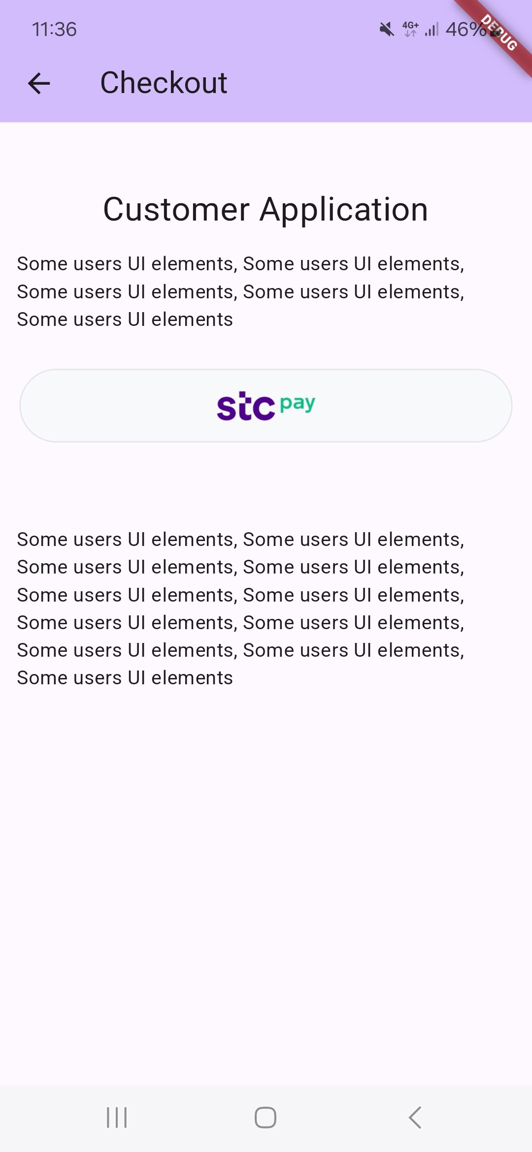
STC Pay
If the STC Pay integration between Ottu and STC Pay has been completed, the Checkout SDK will automatically handle the necessary checks to display the STC Pay button seamlessly.
When the Checkout SDK is initialized with the session_id and payment gateway codes (pg_codes), the SDK will verify the following conditions:
- The
session_idandpg_codesprovided during initialization must be associated with the STC Pay Payment Service. This ensures that the STC Pay option is available for the customer. - In the Android SDK, the STC Pay button is displayed regardless of whether the customer has entered a mobile number while creating the transaction.
Apple Pay
Due to compliance requirements, for iOS, the KNET payment gateway requires a popup notification displaying the payment result after each failed payment. This notification is triggered only in the cancelCallback, but only if a response is received from the payment gateway.
As a result, the user cannot retry the payment without manually clicking on Apple Pay again.
KNET Integration
The popup notification mentioned above is specific to the KNET payment gateway. Other payment gateways may have different requirements or notification mechanisms, so it is essential to follow the respective documentation for each integration.
To properly handle the KNET popup notification, the following Swift code snippet must be implemented into the payment processing flow:
This is only iOS-related stuff, so the callbacks are native and so they are in Swift language.
func cancelCallback(_ data: [String: Any]?) {
var message = ""
if let paymentGatewayInfo = data?["payment_gateway_info"] as? [String: Any],
let pgName = paymentGatewayInfo["pg_name"] as? String,
pgName == "kpay" {
message = paymentGatewayInfo["pg_response"].debugDescription
} else {
message = data?.debugDescription ?? ""
}
navigationController?.popViewController(animated: true)
let alert = UIAlertController(
title: "Cancel",
message: message,
preferredStyle: .alert
)
alert.addAction(UIAlertAction(title: "OK", style: .cancel))
self.present(alert, animated: true)
}
Function Breakdown
The above code performs the following checks and actions:
- Checks if the
cancelCallbackobject contains payment gateway information- It verifies whether the
payment_gateway_infofield is available in the response.
- It verifies whether the
- Identifies if the payment gateway used is
KNET- It checks if the
pg_nameproperty equalskpay, confirming that the transaction was processed using KNET.
- It checks if the
- Check the above two conditions are met by retrieving the payment gateway response
- If the gateway response (
pg_response) is available, it is displayed; otherwise, a default message (Payment was cancelled.) is used.
- If the gateway response (
- Navigates back and displays an alert
- The user is returned to the previous screen (
navigationController?.popViewController(animated: true)). - A popup notification is displayed using
self.present(alert, animated: true), informing the user about the failed payment.
- The user is returned to the previous screen (
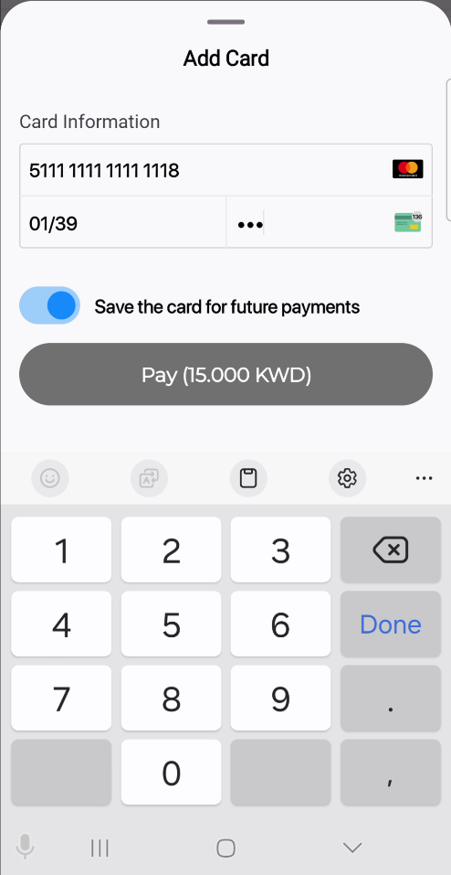
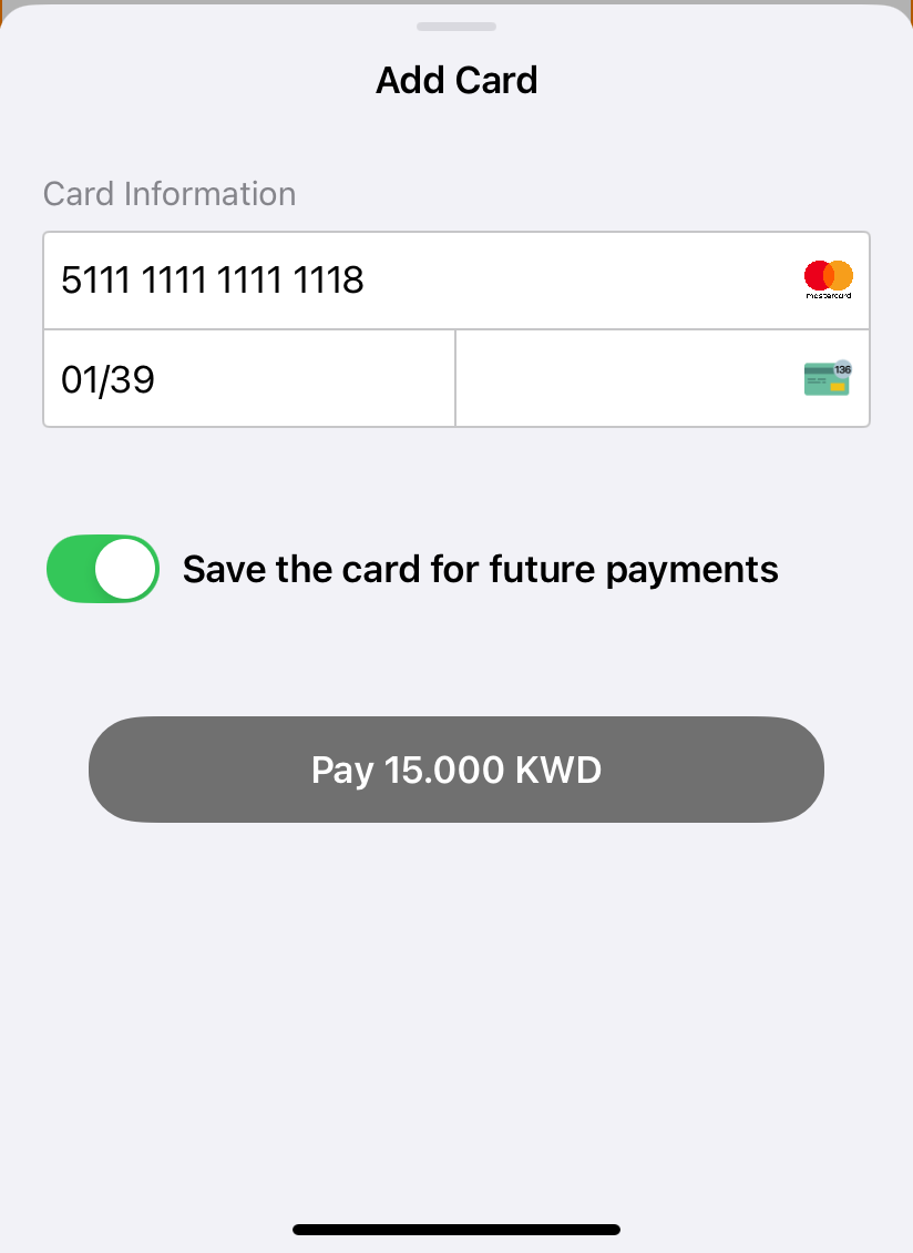
Onsite Checkout
This payment option enables direct payments through the mobile SDK. The SDK presents a user interface where the customer can enter their cardholder details (CHD). If supported by the backend, the user can also save the card for future payments—stored as a tokenized payment method.
The onsite checkout screen appears identical to the native platform version.
Android
iOS
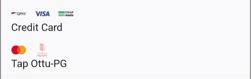
The SDK supports multiple instances of onsite checkout payments. Therefore, for each payment method with a PG code equal to ottu_pg, the card form (as shown above) will be displayed.
Android
iOS
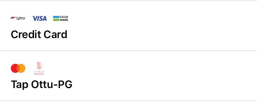
No fees are displayed for onsite checkout instances. This is due to the support for multiple multi-card (omni PG) configurations. The presence of multiple payment icons is used to indicate this multi-card feature.
Callbacks
The callbacks are handled by the native frameworks. Please see the links here:
It is not necessary to modify anything for the callbacks, as they are managed by the native SDK.
However, the following examples demonstrate how they function on both platforms.
It is needed to add a section like below in a *.dart file of the app:
@override
void didChangeDependencies() {
super.didChangeDependencies();
_methodChannel.setMethodCallHandler((call) async {
switch (call.method) {
case _methodPaymentSuccessResult:
{
String message = call.arguments as String;
logger.d("didChangeDependencies, success: $message");
_checkoutMessage.value = ("Success", message);
}
case _methodPaymentCancelResult:
{
String message = call.arguments as String;
logger.d("didChangeDependencies, cancel: $message");
_checkoutMessage.value = ("Cancel", message);
}
case _methodPaymentErrorResult:
{
String message = call.arguments as String;
logger.d("didChangeDependencies, error: $message");
_checkoutMessage.value = ("Error", message);
}
}
});
}
where _methodPaymentSuccessResult, _methodPaymentCancelResult and _methodPaymentErrorResult are defined as constants:
const _methodPaymentSuccessResult = "METHOD_PAYMENT_SUCCESS_RESULT";
const _methodPaymentErrorResult = "METHOD_PAYMENT_ERROR_RESULT";
const _methodPaymentCancelResult = "METHOD_PAYMENT_CANCEL_RESULT";
Also, on the Flutter side, you need to define a MethodChannel to listen for events from the native platforms.
const _methodChannel = MethodChannel('com.ottu.sample/checkout');
errorCallback
Android
The callbacks are defined within the body of the Checkout.init function:
val sdkFragment = Checkout.init(
context = checkoutView.context,
builder = builder,
setupPreload = apiTransactionDetails,
successCallback = {
Log.e("TAG", "successCallback: $it")
showResultDialog(checkoutView.context, it)
},
cancelCallback = {
Log.e("TAG", "cancelCallback: $it")
showResultDialog(checkoutView.context, it)
},
errorCallback = { errorData, throwable ->
Log.e("TAG", "errorCallback: $errorData")
showResultDialog(checkoutView.context, errorData, throwable)
},
iOS
Here is an example of a delegate:
extension CheckoutPlatformView: OttuDelegate {
public func errorCallback(_ data: [String: Any]?) {
debugPrint("errorCallback\n")
DispatchQueue.main.async {
self.paymentViewController?.view.isHidden = true
self.paymentViewController?.view.setNeedsLayout()
self.paymentViewController?.view.layoutIfNeeded()
self._view.heightHandlerView.setNeedsLayout()
self._view.heightHandlerView.layoutIfNeeded()
self._view.setNeedsLayout()
self._view.layoutIfNeeded()
let alert = UIAlertController(
title: "Error",
message: data?.debugDescription ?? "",
preferredStyle: .alert
)
alert.addAction(
UIAlertAction(title: "OK", style: .cancel)
)
debugPrint("errorCallback, show alert\n")
self.paymentViewController?.present(alert, animated: true)
}
}
cancelCallback
iOS
public func cancelCallback(_ data: [String: Any]?) {
debugPrint("cancelCallback\n")
DispatchQueue.main.async {
var message = ""
if let paymentGatewayInfo = data?["payment_gateway_info"] as? [String: Any],
let pgName = paymentGatewayInfo["pg_name"] as? String,
pgName == "kpay" {
message = paymentGatewayInfo["pg_response"].debugDescription
} else {
message = data?.debugDescription ?? ""
}
self.paymentViewController?.view.isHidden = true
self.paymentViewController?.view.setNeedsLayout()
self.paymentViewController?.view.layoutIfNeeded()
self._view.heightHandlerView.setNeedsLayout()
self._view.heightHandlerView.layoutIfNeeded()
self._view.setNeedsLayout()
self._view.layoutIfNeeded()
let alert = UIAlertController(
title: "Cancel",
message: message,
preferredStyle: .alert
)
alert.addAction(
UIAlertAction(title: "OK", style: .cancel)
)
debugPrint("cancelCallback, show alert\n")
self.paymentViewController?.present(alert, animated: true)
}
}
successCallback
iOS
public func successCallback(_ data: [String: Any]?) {
debugPrint("successCallback\n")
DispatchQueue.main.async {
self.paymentViewController?.view.isHidden = true
self._view.paymentSuccessfullLabel.isHidden = false
self.paymentViewController?.view.setNeedsLayout()
self.paymentViewController?.view.layoutIfNeeded()
self._view.heightHandlerView.setNeedsLayout()
self._view.heightHandlerView.layoutIfNeeded()
self._view.setNeedsLayout()
self._view.layoutIfNeeded()
let alert = UIAlertController(
title: "Success",
message: data?.debugDescription ?? "",
preferredStyle: .alert
)
alert.addAction(
UIAlertAction(title: "OK", style: .cancel)
)
debugPrint("successCallback, showing alert\n")
self.paymentViewController?.present(alert, animated: true)
}
}
}
Examples
Basic Example
ValueListenableBuilder(
  valueListenable: _checkoutHeight,
  builder: (context, height, child) {
    return SizedBox(
      height: height.toDouble(),
      child: OttuCheckoutWidget(
        arguments: CheckoutArguments(
          merchantId: "alpha.ottu.net",
          apiKey: 'your Api key',
          sessionId: 'your session id',
          amount: 20.0,
          showPaymentDetails: true,
          paymentOptionsDisplaySettings: PaymentOptionsDisplaySettings(
            mode: PaymentOptionsDisplayMode.BOTTOM_SHEET,
            visibleItemsCount: 5,
            defaultSelectedPgCode: "",
          ),
        ),
      ),
    );
  },
),
Full Example
final displaySettings = PaymentOptionsDisplaySettings(
mode: state.paymentOptionsDisplayMode ?? PaymentOptionsDisplayMode.BOTTOM_SHEET,
visibleItemsCount: paymentsListItemCount,
defaultSelectedPgCode: state.defaultSelectedPayment,
);
final args = CheckoutArguments(
merchantId: state.merchantId,
apiKey: state.apiKey,
sessionId: state.sessionId ?? "",
amount: amount,
showPaymentDetails: state.showPaymentDetails,
paymentOptionsDisplaySettings: displaySettings,
setupPreload: state.preloadPayload == true ? _apiTransactionDetails : null,
formsOfPayment: formOfPayments?.isNotEmpty == true ? formOfPayments : null,
theme: _theme,
);
//
Scaffold(
appBar: AppBar(
backgroundColor: Theme.of(context).colorScheme.inversePrimary,
title: Text(widget.title),
),
body: SingleChildScrollView(
child: Column(crossAxisAlignment: CrossAxisAlignment.stretch, children: [
SizedBox(height: 46),
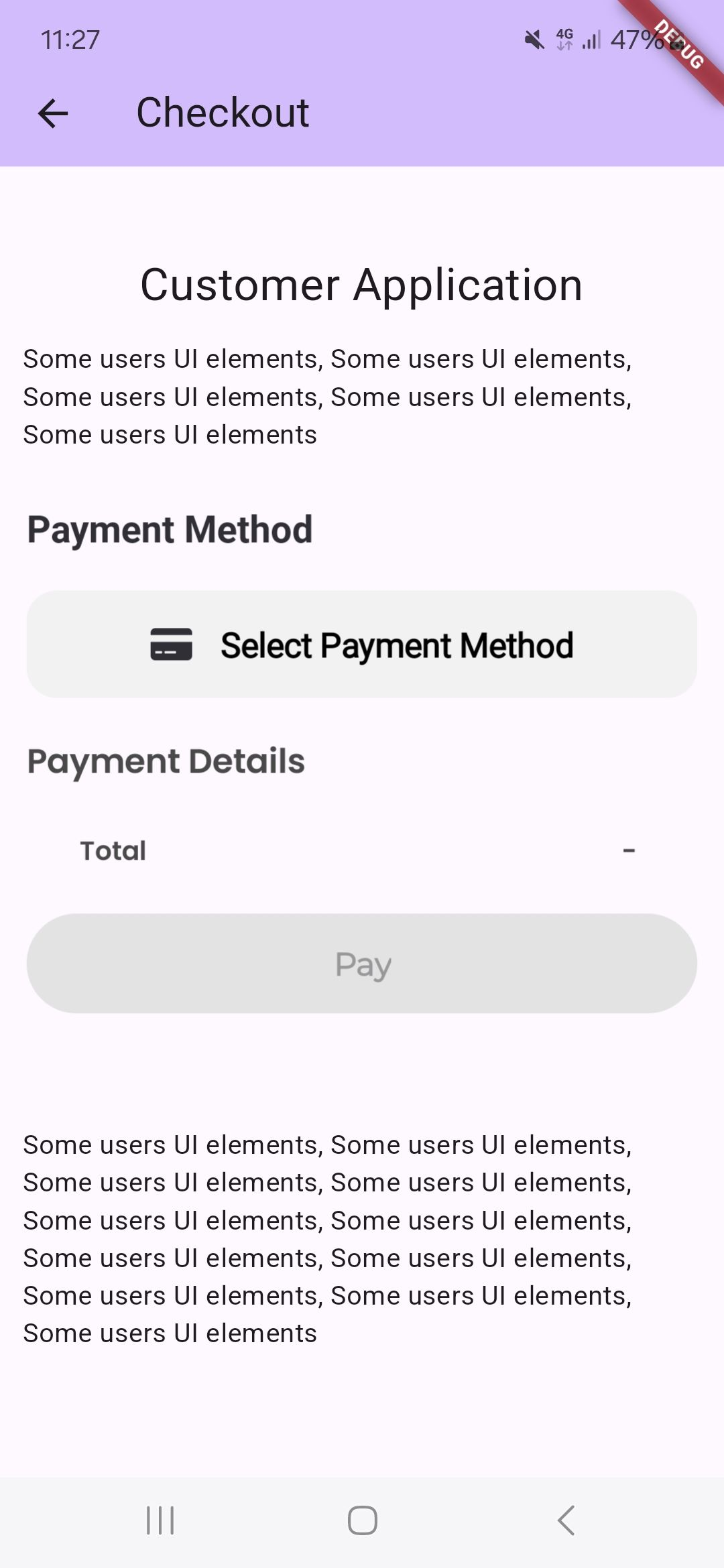
Text(
"Customer Application",
textAlign: TextAlign.center,
style: ts.TextStyle(fontSize: 24),
),
//Start of Merchant content
const Padding(
padding: EdgeInsets.all(12.0),
child: Text(
"Some users UI elements, Some users UI elements, Some users UI elements, Some users UI elements, Some users UI elements")),
//End of Merchant content
Padding(
padding: const EdgeInsets.all(12.0),
child: ValueListenableBuilder < int > (
builder: (BuildContext context, int height, Widget ? child) {
return SizedBox(
height: height.toDouble(),
child: OttuCheckoutWidget(arguments: widget.checkoutArguments),
);
},
valueListenable: _checkoutHeight,
),
),
const SizedBox(height: 20),
//Start of Merchant content
const Padding(
padding: EdgeInsets.all(12.0),
child: Text(
"Some users UI elements, Some users UI elements, Some users UI elements, Some users UI elements, Some users UI elements,"
" Some users UI elements, Some users UI elements, Some users UI elements,"
" Some users UI elements, Some users UI elements, Some users UI elements")),
//End of Merchant content
])),
);
Releasing Your App
Android
Follow these steps to prepare and release your Android app properly:
- Update the
proguard-rules.proFileWhen you are ready to release your app, the first thing to do is update your
proguard-rules.profile.- Navigate to your project directory:
App/android/app/- Open the
build.gradle.ktsfile.
- Verify or Add ProGuard Configuration
- Scroll to the
buildTypessection. - Check whether the ProGuard configuration has been added.
- If it's missing, add the following lines:
buildTypes {
    getByName("release") {
       ...
       ...
        // Verify this configuration in your build.gradle file
        proguardFiles(
            getDefaultProguardFile("proguard-android-optimize.txt"),
            "proguard-rules.pro"
        )
        signingConfig = signingConfigs.getByName("debug")
    }
}
Ensure that the
proguard-rules.profile exists in theApp/android/app/directory. If it doesn't exist, create it manually. - Scroll to the
- Build the Release APK
Run the following command to build your release APK and verify that all required properties are properly configured:
flutter build apk - Resolve R8 Compilation Errors (If Any)If you encounter an error such as the following:
ERROR: Missing classes detected while running R8. Please add the missing classes or apply additional keep rules that are generated in /build/app/outputs/mapping/release/missing_rules.txt.
ERROR: R8: Missing class com.google.devtools.ksp.processing.SymbolProcessorProvider (referenced from: com.squareup.moshi.kotlin.codegen.ksp.JsonClassSymbolProcessorProvider)
FAILURE: Build failed with an exception.
* What went wrong:
Execution failed for task ':app:minifyReleaseWithR8'.
> A failure occurred while executing com.android.build.gradle.internal.tasks.R8Task$R8Runnable
   > Compilation failed to complete
Do the following:- Navigate to the file path below:
build/app/outputs/mapping/release/missing_rules.txt- Copy the rules listed in this file.
- Paste them into your
proguard-rules.profile.
- Rebuild and Verify
After updating the ProGuard rules, run the release command again to ensure all issues are resolved:
flutter build apkIf the build completes successfully, your app is ready for release.
Error Reporting & Security
Error Reporting
The SDK utilizes Sentry for error logging and reporting. It is initialized based on the configuration provided by SDK Studio.
However, since the SDK is a framework embedded within the merchant's app, conflicts may arise if the app also integrates Sentry.
To prevent conflicts, the merchant can disable Sentry within the Checkout SDK by setting the is_enabled flag to false in the configuration inside the SDK studio.
Rooting & Jailbreak Detection
The Flutter SDK does not perform rooting or jailbreak detection independently. Instead, these security checks are entirely handled by the native SDKs.
For more details, refer to the following links:
Screen Capture Prevention
The SDK includes mechanisms to prevent screen capturing (such as screenshots and video recordings) on screens that display sensitive information. The Flutter SDK does not handle this independently; instead, it relies on the logic implemented in the native SDKs for Android and iOS.
Since the implementation differs between the two platforms, please refer to the respective native documentation for more details.